Case Studies
Scannable: a 5-star design process
Scannable is a market-leading app that grew from noticing a user habit. It’s currently rated 4.9 stars on the App Store with 377,000 reviews. So, how does an app like this get designed and built?
Starting with user behaviour
Evernote noticed that increasing number of its users were taking photos of documents, rather than scanning with a hardware paper scanner. Evernote also noticed increasing use of its APIs from 3rd-parties that were building simplified ‘snap and save’ phone-camera-based apps. So we knew that the user model was already there…people had a paper document they wanted to either save, or send somewhere, and that loading a ‘heavy’ app like Evernote was too cumbersome for the task. So our team was tasked with designing and building a best-in-class document scanning app for iOS.
There were three designers that worked on the core app…with each focussed on a particular area. I focussed on the capture experience, so I’ll focus on that here.
We started with three actual humans to act as personas/alpha testers
Starting with understanding the customer
The team started with three real-world ‘personas’. Or more accurately, alpha-users who we could ask to come in and actually try out prototypes, test other existing software, and meet on-site to understand their context and needs. Each of these people worked in the real world with paper documents, in a small office, home office, or roaming role. One in real-estate and the others were business consultants. They proved invaluable.
Austin Design Studio
Users’ expectations were that they could be quite close to a paper document to capture it in view, whereas in reality they needed to be much further, resulting in an ergonomic grip that made triggering capture more difficult.
One of the first things we did was to bring them into our little design studio, and watch them use other apps that already existed in the space. We also utilised remote usability testing on other, existing apps. Something became very clear — the actual process of capturing the image was challenging to users.
Users intuited that they could be quite close to a document in order to capture it. However, and especially with the iPhone cameras of the time, they needed to be further away than expected. The consequences of this was that either the user took a partial image of the document, which our software was unable to deskew correctly. Or, they moved the required distance away from the document (usually sitting on a table or desk) and found themselves in an ergonomically difficult place to hit any on-screen capture button.
Early animation/prototype to show in-view capture and review.
Capturing intent
So, I started to animate, and prototype a capture experience that would do three things — capture the document in the same view as the camera, show a preview of the capture, and inform the user that it was being added to the existing pages. This meant users could capture, capture, capture, without needing to resort to changing their hand position in order to capture, or review, or approve a snap.
But early prototypes showed an issue: users were suprised by the automatic capture experience. They didn’t realise the the app would capture automatically, and repeatedly surprised when it did. So, I worked on various attention-getting ‘document detected’ animations in order to help educate the user.
Attention-grabbing ‘detecting document’ animations
A simple overlay and timer told the story we needed.
In the end, a much simpler count-down timer proved to be the winner. And what looked like quite simple experience was powered by a very in-depth relationship between design and development.
And this was needed due to an inherent problem in taking a photo of a document on a desk: gravity.
The gravity of the problem
Paper on a desk is parallel to gravity. This means accelerometer data is useless for orienting the document, requiring some other way of working out which way is ‘up’. And our solution was extremely sophisticated — realtime on-device OCR. This solution, like many, came with a side-effect. In the case of the user taking a photo of a whiteboard (a common use case), the OCR would be unreliable due to the sloppy handwriting that is so common in white boarding sessions. A whiteboard can’t be accurately OCR’d, but accelerometer data is this case is actually the truth. So I developed a simple prototype that listed to accelerometer data on a real phone tethered to my Mac. This allowed me to work out the ergonomic angles and other subtle heuristics coming from the 3D sensor that could be ‘plugged in’ to the codebase. This allowed us to revert to using accelerometer data for whiteboard cases.
Paper on a desk is parallel to gravity. This means accelerometer data is useless for orienting the document, requiring OCR. A whiteboard however can’t be accurately OCR’d, but accelerometer data is more useful.
In the end, after healthy organic iteration in the designs, we shipped the app. And it’s something I’m very proud of — and is reflected in its continued use and extremely high App Store rating after many years of staying basically untouched.
Final shipping App, with realtime OCR and rotation animation.
Sunflower Labs early hardware renders.
sunflower Labs: design and deep tech
high tech home security
Sunflower Labs had an audacious goal — autonomous home security drone directed by super-intelligent garden lights. And innovation, with engineering working hand-in-hand with design, was the only way to achieve it.
The startup was in early stages. Prototype hardware existed, but the aim was to show the entire experience that an end-user would would. This was to include seeing and sending basic intentions to the drone, as well as controlling the garden lighting. But I’m getting ahead of myself, so please let me explain.
Actual light prototypes.
sunflower and the bee
The ‘sunflowers’ in the system are solar-powered, extremely smart garden lights. If you’ve ever gone to Bunnings and bought a handful of little solar garden lights, then you’ll understand. The job of the lights is usually to bring a little light and safety to those areas of your front and back yard where the houselights don’t reach.
The ‘bee’ is a sophisticated autonomous drone, with no user-controlled flight. It’s job is to literally be told where to go by the system (cutely called ‘the hive’) and to get itself there safely, without running into a tree branch, and point its camera at the area of interest. But what is the area of interest? Well, that’s where the sunflowers, ahem, shine.
A network of light
Prototype showing ambiguous positioning, playing on the ‘bee’ hexagon parti.
Each solar-powered sunflower packs a sophisticated CPU and radio communications package, as well as a set of IR and other sensors. These let each sunflower have a sense of movement around it, measured in various degrees. A basestation took all this information from the various lamps in a yard, and triangulated to work out the speed, direction, cadence and other information about animals (lost dog or raccoon-gone-bad) or possible intruders. My initial job was finding ways to represent initially vague positional information to the user, who may decide to remotely deploy the drone.
moving fast, not breaking things
My next challenge was to design and work very quickly with a developer to build a prototype iPad control app. This was used for showing positioning information as well as live drone camera view. It had to be big and robust, but also be reasonably sophisticated looking as it was used for real demos to shareholders. This demo needed to work, since there was often only a single chance to demo to a single real potential investor.
A view of the app in Flight Mode, showing Sunflower data as well as Bee controls and camera view.
An interesting challenge was working with very early electronics — being constrained by, and in some cases defining the very characteristics, for example refresh rates of colour interpolation, various ‘white’ colour temperatures and required physical lumens of brightness. I designed a set of themes, including animated networked styles for various modes including parties, home alert, and ‘welcome home’.
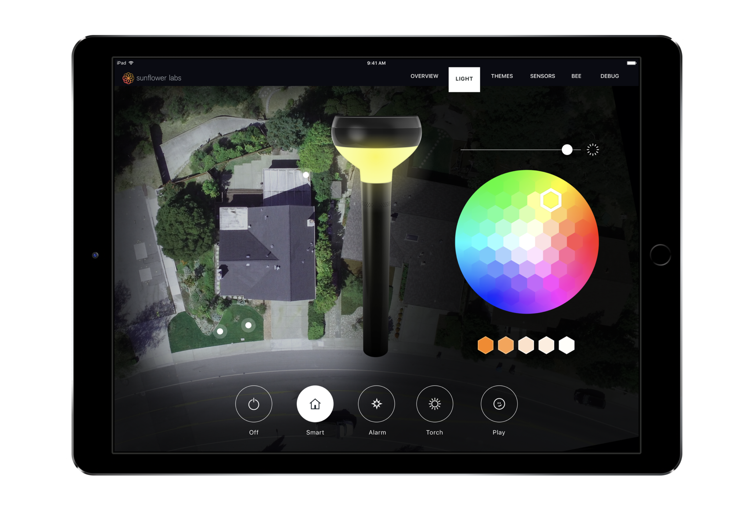
Remote light control app for testing, colour, white temperature, sound.
Animations to demonstrate light sequence ideas.
I’m very proud of the work I did at Sunflower Labs, and the company did get its investment and has recently started shipping its units out around the world, including Australia.
Me at the whiteboard, Evernote office in Austin, Texas.
mentoring: Building a team as well as products
Experiences in teaching and mentoring in Product Design.
I’ve been extremely fortunate to have worked, and been mentored by, many great designers as well as developers, product managers, CEOs and others. For example, while at Evernote, I had a team of three designers report to me and I must say I think I learnt as much from them as they did from me!
As a result of the opportunities I’ve had, I try to give back to young and upcoming designers and founders in various ways.
This is the third year I’ve been invited to be a ‘Giants’ mentor at the renown Australian VC firm, Blackbird’s accelerator programme. There I help early founders understand the basics of design, product design, marketing, decisions on features, apps and all matter of things.
I also have spent multiple years as a mentor for the University of New South Wales accelerator programme. Here students are at the very early stages of ideas, and I have helped with ideation, quick mockups, and talking them down from feature-itis.
I’ve also run day-long professional masterclasses, as well as short design-101 sessions. I’ve taught Masterclass content around:
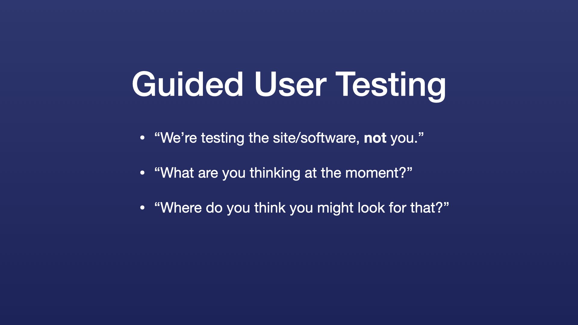
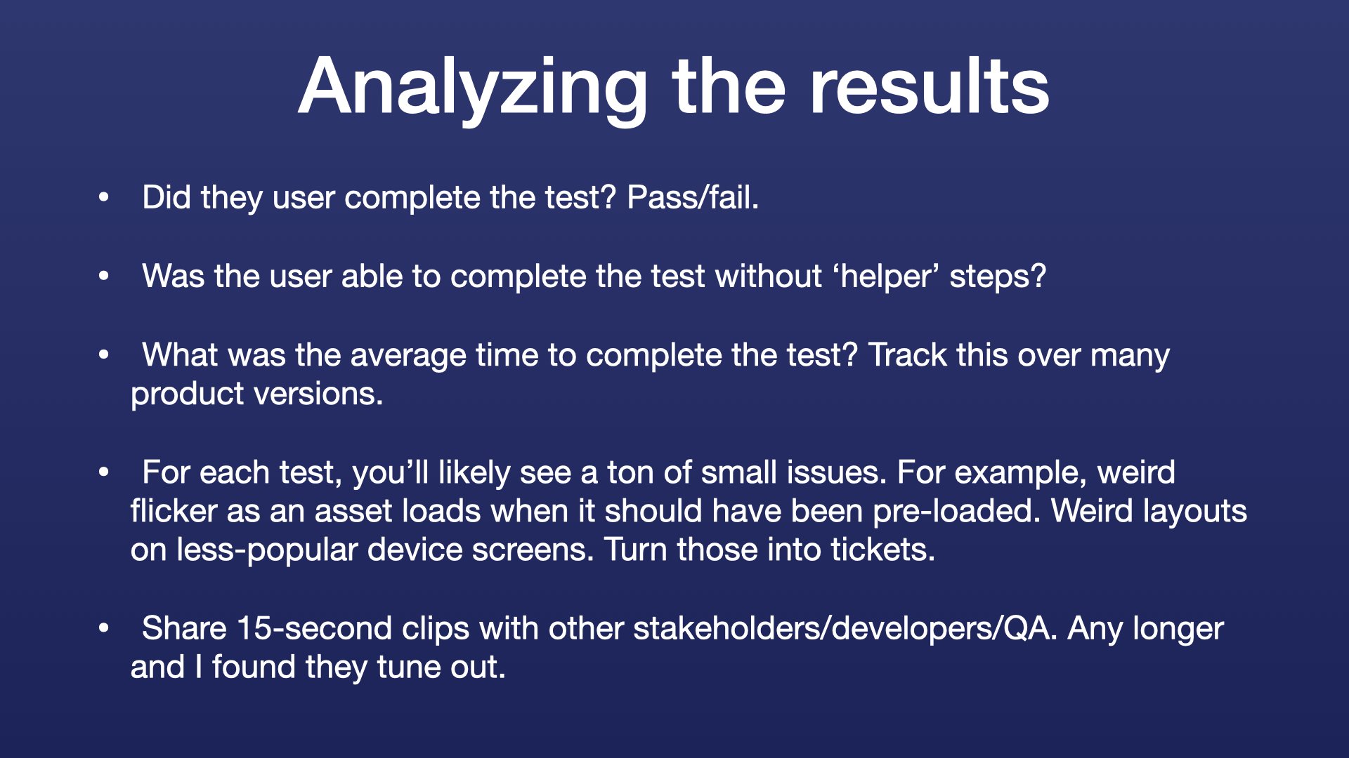
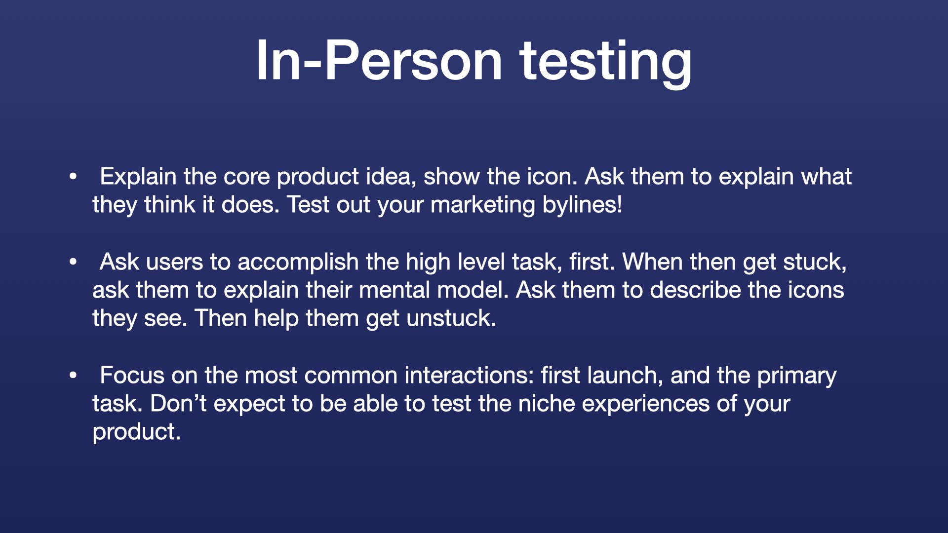
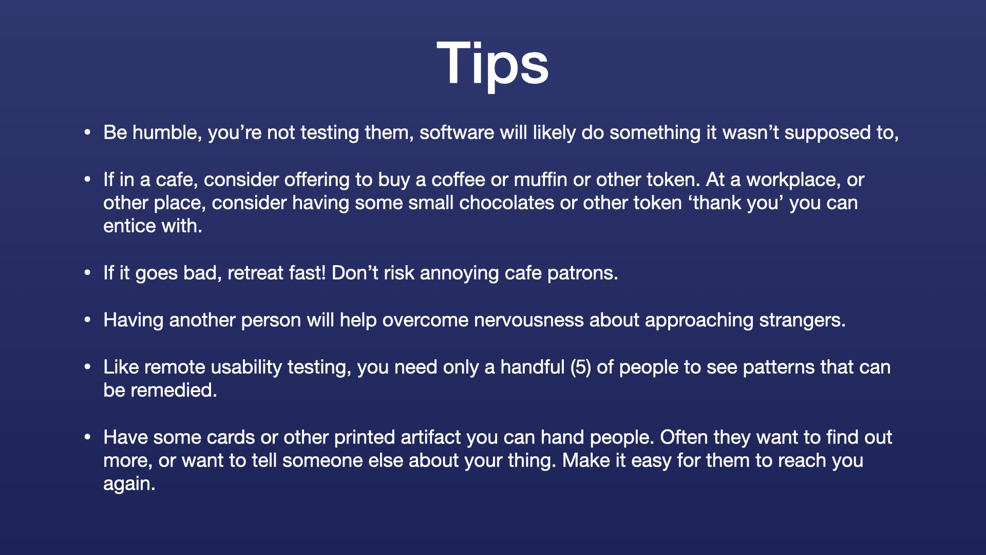
User/usability testing, including formal, guided, and guerrilla testing
Branding
App design
Information Architecture
Prototyping
Design effectiveness in organizations
and more
Various slides on branding mechanics from one of my short talks.
One fun project was helping a young founder to imagine and visualise a product on a real shelf; the product being a green charity gift card that would be hanging, say in Woolworths, alongside gift cards from BCF and Ticketek. There’s a certain glee when someone sees something in their head represented on the screen as it were real. Suddenly making it a real product doesn’t seem so daunting.
The green gift cards are faked in place to imagine a new product where charity donations can be bought as a gift card.
The most common mistakes non, and young, designers make
I’ve been there and made the mistakes, so I know what to look for 🙂
Mistake 1: Thinking the materials don’t matter
Young, or new designers often see the materials (be they app libraries, code, physical materials, electronics, or whatever the experience is produced by) as getting in the way. They want to ignore the ‘stuff’ and focus on the experience…I’ve also seen this expressed by management. I’ve found, the more you know the material, the more it helps to actually craft a great experience. I encourage new designers to sit closer to the developers, not further away.
Mistake 2: Being afraid to change
Young, and new designers can lack confidence. But this can mean that they feel the need to back a single, original design, even when it shows its weakness in early prototypes or usability testing. Instilling more confidence that the right idea and implementation will come, given enough sweat, is the way.
Mistake 3: Undervaluing the power of ‘Production’
A story I really love to tell: a friend of mine used to work regularly with Steve Jobs as part of an agency (in the early days Apple still had outside design agencies do work for them). He told me a story once, of doing some design work for Apple, producing beautiful minimal icons —of course that were required at the very last moment. After a heroic effort, the submline and minimalist icons were designed and sent to Apple. On keynote day however, the team that drew those icons saw them wrapped in extra shine and ‘Aqua’ when presented on the big screen. In their next meeting they asked Steve ‘Why did you do it? We know you understand minimalism, so why did you add that extra stuff?’
The answer Steve gave was that ‘only Apple has the designers that can do that’. He implied that the power of that uniqueness, the production quality, had a value that overrides minimalism. And I’ve seen that there are parts of design, like app icons, where the value of an unreasonably well-made thing can pay back huge dividends. Not only is it the first impression that customers get, but can be a proud moniker that an entire development team can rally around.


